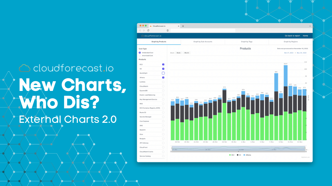
New Charts, Who Dis? External Charts 2.0

Last updated 25 May, 2023
4 mins read
We’ve put in a lot of effort this year to fix and correct many of our early “mistakes” as a bootstrapped startup. There are no regrets, as many features were initially built with utility and speed in mind. However, as Francois likes to remind me, these were areas he was not proud of as our technical leader.
With a strong engineering team at our disposal this past year, we’ve managed to redesign our whole app, and improve the look of our “Why?” Drill-downs. Our feature velocity for our users has increased tremendously. To continue this theme, we turned our attention to fully rebuilding and rethinking our External Charts that are part of our Daily AWS Cost Monitoring Reports.
Old External Charts
This MIGHT be an unknown feature (this was intentional), but if users clicked this small button in the Daily AWS Cost Monitoring Reports via Email or Slack, users were led back to a stacked bar chart in our app:
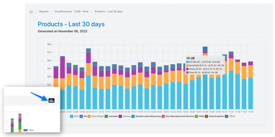
The external charts in the app allowed users to hone in on an AWS product/service through the filters below and quickly see the day-over-day deltas by hovering over the stack bar graphs. The data and information in these charts were very surface-level.
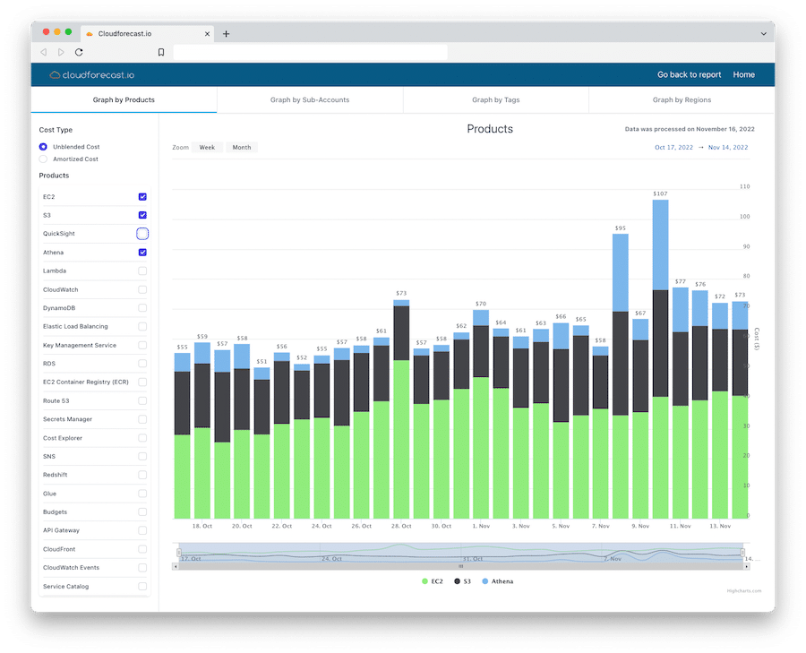
New External Charts 2.0
If our users click on the same button in our AWS Daily Cost Monitoring Reports today or any of the links in our Slack report, they will discover a new experience:
Improvements and Features
Here are the improvements made to our External Charts:
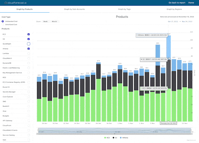
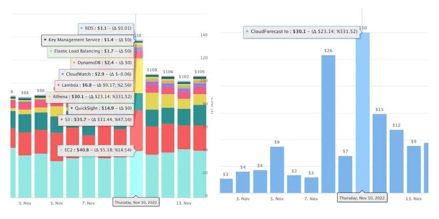
- Drill-down: Hover over any part of the stacked bar chart and drill down into a specific service listed. Users can now drill down into sub-accounts, regions, or usage types/operations.
- Filters: Filter out different parts of the stacked bar graphs to focus on specific products/services.
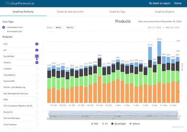
- Deltas: See day-over-day deltas by hovering over any of the bars.
- Shareable: All these charts are shareable if you have SSO and Multi-user support enabled on your account.
- Graphs by Products, Sub-accounts, Tags, or Regions: Start your drill-down with any of these dimensions.
With these improvements and data in our “Why?” Drill-down, users can quickly visualize, understand and monitor their most immediate AWS costs without the mind-numbing investigative work. In less than 30 seconds, our users can know the exact reasons for any AWS cost increases.
Note: This feature is only available in our paid subscription plans. This feature is not available in our Free Community Plan.
How Is This Different From AWS Cost Explorer?
As we preach to our users, CloudForecast is not an AWS Cost Explorer replacement or another “Cost Explorer on Steroids” cost monitoring tool that will cost you an arm and a leg with super complex dashboards. The central vision for CloudForecast is to be the best in providing AWS Cost Visibility and Monitoring for busy engineers.
This new feature lets our users get quick and focused answers to many of their AWS costs questions without interrupting their busy day. We made this feature as user-friendly as possible to lessen the typical mind-numbing detective work with native tools like AWS Cost Explorer. We understand that our user’s time is valuable.
It shouldn’t take 30+ minutes to build the right view and set the right dimensions/filters to get the answers you need with AWS cost. This is where CloudForecast tools and reports shine. See us as your “first line of defense” when AWS cost overspending pops up and where you can get quick answers.
What’s Next For Us?
We’re focusing on improving visibility around your AWS Reserved Instances, AWS Savings Plans, Data Transfer, and AWS Resources. In addition, we’re re-working our UI/UX to bring a more unified approach to our Daily Cost Report, Monthly Financial Report, and ZeroWaste. You’ll be able to slice/dice these reports by tag keys, tag value, or sub-account and send them directly to your team members in a unified manner.
We want to continue being the best AWS cost visibility product out there for busy engineers and technical teams. This starts with feedback directly from our users and understanding their day-to-day jobs. If you have feedback on ways we can improve our features, feel free to reach out! We’re always looking for ways to improve.
Manage, track, and report your AWS spending in seconds — not hours
CloudForecast’s focused daily AWS cost monitoring reports to help busy engineering teams understand their AWS costs, rapidly respond to any overspends, and promote opportunities to save costs.
Monitor & Manage AWS Cost in Seconds — Not Hours
CloudForecast makes the tedious work of AWS cost monitoring less tedious.
More from CloudForecast
AWS cost management is easy with CloudForecast
We would love to learn more about the problems you are facing around AWS cost. Connect with us directly and we’ll schedule a time to chat!
